
Plotting
QSAS provides a flexible interface to construct plots from any relevant object held on the Working List, both imported data and the results from Analysis within QSAS. The various plot interfaces are brought up from the plot pull-down menu on the QSAS Main Window.
Using the Plot Layout menu item, QSAS can produce multiple pages of plots, and each of these may be comprised of an arbitrary choice of plot panels of different types in a user configured layout.
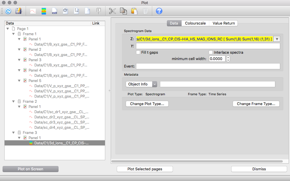
The plot pages, panels and associated data are all placed on a list view similar to that of the main Working List. In place of a hierarchy of folders, the plot list view comprises a hierarchy of pages, frames, (stacked) panels and data objects corresponding to the traces or spectrograms. The deepest level of the plot list heirarchy is always the data object to be plotted.
Options on each level of this hierarchy can be accessed through the tabbed views on the right of the plot window. Options available to the objects selected in the list view show the current values applicable to the selected item. Multiple selection is possible in the list view (shift or control select), in which case the value shown applies to all selected items and changes apply to all selected items. If the items in a multiple selection have a different value for an option, only the first will show, and the option appears greyed to indicate that this value does not apply to all items selected - a new value can still be set for these selections.
The Plot on Screen button enables the user to see the effect of any changes to plot layout options at any time, and the plot window is re-used for each plot unless specified otherwise via the window number selector in Output on the Page tab for a Page item.
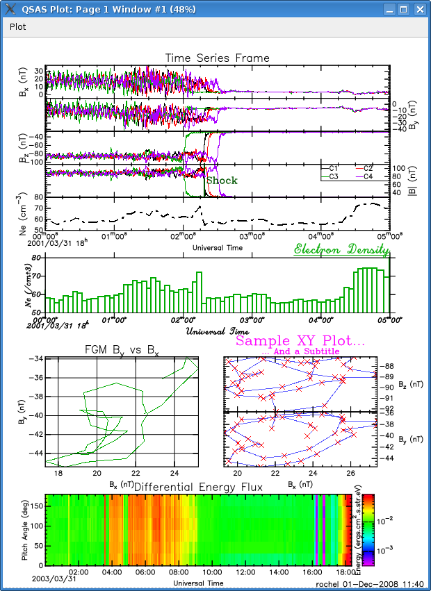
As an example, the following plot demonstrates the main capabilities of the plotting functionality offered by QSAS.
The actual plotting is performed by the PLPLOT graphics library. Screen plots use a custom Qt driver, which also handles saving as pictures and printing.
QSAS plots are constructed as a collection of frames containing stacked plot panels. Each frame is self-contained with its own title and x (or time) axis-labels and contains a number of panels with their own y axis properties. The panels may contain various individual traces. The data for each trace are taken from data objects on the Working List by Drag and Drop of the name (or Cut/Paste or Typing directly) into the plot list or Trace Data slot in the Data tab of a trace slot.
Vector objects are recognised and present the user with a pull-down menu from which any cartesian or polar component (or magnitude) can be selected. Different behaviours when dropping vector objects can be obtained, which are set up in the Profiles. By default, all axis ranges are automatically scaled to the envelope of the ranges for all traces in that panel.
Conceptually, there are two routes for creating a plot, either by dragging data objects into the plot list and adjusting the resulting default panels, or by first creating a plot layout with empty panels and then adding data objects. In either route both the data and plot layout can be modified at will.
To view data graphically, open the plot interface through the Plot/Plot
Layout menu item. Drag an object (or objects) from the Working List
into the list window on the left of the plot interface. Panels containing
the trace(s) will be created with a default style (time series trace for time tagged data and spectrogram for array data).
Clicking on the Plot on Screen button will launch plplot and
display this default
plot. Note that vectors will default to two panels, one containing R
and the other the X, Y and Z traces. Defaults can be controlled through
the Profiles menu on the QSAS main window.
Pages can be created using the Insert/New Page pulldown menu. Different pages appear as different windows when the Plot on Screen button is clicked.
Interface elements can be moved by simple Drag and Drop to valid targets.
Dragging to an existing trace will replace the data in that trace with the new data object being dragged in. The data object can also be changed by dragging or typing in the slot in the Trace Data area in the Data tab of the Plot options window. The panel type for a data object can be changed through the data tab when the trace is selected.
When an item is selected in the plot list view a set of tab panes appear in the right hand side of the plot window allowing control of the options applicable to that level of plot design. See Changing a Plot Layout for details of these options.
When multiple selections are made the changes will apply to all selected items.
When a vector object is dropped into a trace, the Trace Data area in the the Data tab will show the component of the vector to be plotted in the data slot, and the name on the plot list will have an extension reflecting this choice. The selected component can be changed using the pull down to the right of the component slot, and the data name will change automatically to reflect this.
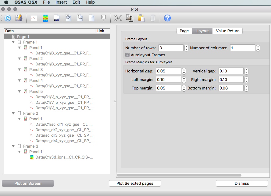
When the Plot Layout window is first launched (from the Plot menu) the Plot List on the left of the window contains a single plot page called "Page 1".
The Insert menu pulldown allows the insertion of various plot items (see Plot Types) to the last selected item in the list. Traces so created are initially empty and have a default name. When a data object is subsequently dropped onto the trace (or into the Trace Data slot in the Data tab of that trace) the trace will be filled with that data and its name will change to reflect this. The data content of a trace can similarly be changed by the same drag and drop with a new data object from the Working List.
Standard plot designs are shipped with QSAS and may be opened from the Plot window using the Insert/Template option. The plots can be populated by dragging data objects from the Working List on the main window to the various traces in the Plot List. Applying the template to plot an object in the working list is done simply by dragging the object on the first item of the template.
The Vector templates contain pre-defined layouts to display the various components of a vector time series. For example, choosing Vector_R_L_P as a template and dragging a vector time series on the first item will insert the R, Latitude and Azimuth components of the vector in 3 stacked panels in a frame.
The 2, 3 and 4 panels templates are only a shortcut for a frame of 2, 3 and 4 stacked panels.
The C1_2_3_4 and C1234 templates define presets to plot Cluster data either in stacked panels or the same one, with standard Cluster colours. Dragging data from the first Cluster spacecraft on the first item in this template will populate the other 3, auto-completing the Data information based on the name of the dragged object for C1.
The set of tabs on the right side of the plot layout window control all aspects of plot design. Tabs are visible which apply to the highest level of the plot objects selected in the Plot List view. Changes to these options apply to all selected items in the Plot List, but do not affect un-selected items.
The root level item in the Plot List represents a page. A page will be printed on a new sheet of paper when printed and displayed on a new window when plotted. When a Page(s) are selected in the Plot List the right hand portion of the Plot Layout window shows three tab panes. The Page tab allows the user to set the page size and orientation as well as the measurement of unit used when creating a custom paper size. This represents the paper size for a printed output and the window size for a plot on the screen. The default plot size is A4.
The Page tab also allows the user to select a different window id to prevent a new plot overwriting an old plot which is to be kept (the default behaviour is to re-use a window).
The Layout tab allows the user to adjust how the panels are placed in a regular grid on the page. The number of rows and columns selectors are linked and only permit valid layouts, e.g. three panels on a page can be laid out as a column of 3 panels, a row of 3 panels or a 2x2 grid with one empty space. This tab also allows the page margins and spacing between panels to be changed. Default values are set to allow for labels with the default character size, and for plots to fit on most laser printers. This tab contains the Autolayout Frames toggle which is set to on as default. With this default setting QSAS will automatically arrange positions and sizes of frames on the page so as to ensure they do not overlap. To change the arrangement of frames on a page, deselect Autolayout Frames and use the Position tab for each frame.
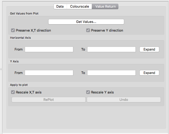
The third tab for pages is Value Return, which launches an interactive value return window to select regions within a panel and re-plot this selection (zoom). This interface can also return the time interval or selected value ranges as data objects on the Working List. This tab appears for each level in the hierarchy (page, frame, panel, trace/spectrogram).
When a frame item(s) is selected in the Plot List, five tab panes are shown on the right of the Plot Layout window.
The T Axis or X Axis tabs control the characteristics of the horizontal axis including the labels to be displayed. Default labels are taken from the Lablaxis attribute in Cluster data. These tabs also control the scale type, range and number of major ticks in the range and minor ticks between major ticks. Tick marks can be set inside the panel frame or outside. The T Axis tab has an input slot which accepts any time interval or time sequence object to use as the time range for plotting, although the time range can be autoscaled from the input data (default) or set manually.
The Position tab allows the user to manually control the width and height of the panel and its offset from the left and top panel or margin. To allow user setting of frame positions and dimensions you must first deselect Autolayout Frames toggle on the Layout tab of the page. Take care, since once the user has control of frame positions it is possible to overlap frames or push them off the page. Note, however, that QSAS tries to ensure that a frame's dimension plus its offset does not exceed the page width or height.
On the Position tab, selecting Fixed in the Aspect ratio box ensures that re-sizing the width (or height) automatically changes the height (or width) to maintain the existing aspect ratio.The Square option ensures that the X and Y dimension of the panel on the page are the same, while the Isotropic option will ensure that the x and y axes have the same length for equal ranges such as would be needed for X-Y plots of positions (such that circles remain circular on the plot). Note that with the Isotropic option the aspect ratio fails if one axis is below the minimum permitted for a frame while the other exceeds the page dimension, and sub-sampling on the longer axis in the relevant Axis tab will be necessary.
The Frame tab controls the line width, tick mark length and colour of the frame. It does not affect the traces in the frame's panels. It also allows some or all borders to be hidden and for tick marks and labels to be attached to different edges. A single line at zero for X and/or Y can also be drawn using this tab.
The Title tab controls the content and format of the title for the frame, and the default title is taken from the Fieldnam attribute if present.
The Value Return tab was discussed in the Page subsection.
When a panel item(s) is selected in the Plot List, three tab panes are shown on the right of the Plot Layout window.
The Y axis tab controls the characteristics of the vertical axis, exactly as the X axis and T axis tabs at frame level.
The Legend tab controls the display and characteristics (placement, border, size, font, line length fraction etc) of the legend box for panels (and stack panels) containing traces. The legend text for each trace is set on the Data options tab for the plot data object in question. For spectrogram panels, the Legend tab has no effect (unless the panel also contains traces). In this case, the Legend tab will be disabled and appear greyed out.
The Value Return tab was discussed in the Page subsection.
The trace item is the deepest level of the hierarchy in the plot list. It represents the data to be plotted within a panel. The Data tab associated with a trace allows the type of data plot to be changed through the plot type pulldown, and shows the name of the data object on the Working List in the Trace Data Y: input slot. This data name field is editable allowing the data object(s) associated with this trace to be changed. A new object name may also be dropped into the Trace Data Y: input slot to change the data used. In the case of a TS plot the time tags are taken from the Time_tags cross reference (imported from the epoch variable for a Cluster file) of the selected Y data object. In the case of an XY trace an X: input slot will also be present in the Data tab. If the input data object is a valid three vector then an extra pulldown input is added to the Data slot to allow selection of which component (or magnitude) of the vector is to be used for the trace. The legend text for this trace is also set here and a checkbox for toggling inclusion of an entry for this trace in the legend.
The trace tab allows the user to set the line colour, thickness, style (e.g. solid, dashed etc) and choice for connecting data points (e.g. histogram, linear or none to leave only the data point symbols). Symbols for the actual data points can be set independently of the line style, which choices for symbol, colour and size of the data point symbols.
Data gaps are not plotted. No line of the selected
style will be drawn between data points on either side of a gap. So for a time series with n-1 gaps, the
data will be plotted as a sequence of n discrete traces. If the chosen symbol is set to None then
no data will be plotted at all over the data gaps, otherwise the data will appear as discrete points in the
chosen style e.g Point.
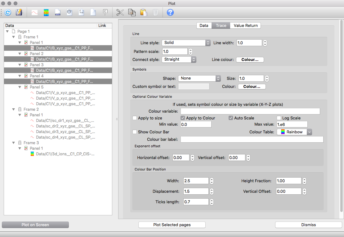
It is further possible to vary both symbol colour and/or size according to the value of another variable. The bottom half of the Trace Tab controls this.
If no Colour variable is provided, then this portion of the
tab has no effect. Thus one could plot a trace for the x component of a
vector, but have either symbol size or colour vary according to the
magnitude of the vector by putting the same object in the Colour variable
and selecting R from the pulldown. The colour variable can be any
variable covering the same time interval, and must be reduced to a
scalar value through the Colour variable slot pulldown.
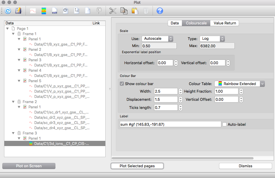
A spectrogram display style differs from the trace in that in place of the trace tab there is a colourscale tab to choose between a limited number of colour scales for the spectrogram and whether it is to vary linearly or logarithmically. It is also possible to manually set the values associated with the minimum and maximum colours on the scale to constrain the value region over which the spectrogram colours vary.
The Data tab for a spectrogram has an additional input slot Z: which accepts any sequence of 1-D arrays. For a TS Spectrogram the time tags are taken from the Time_tags cross reference (imported from the epoch variable for a Cluster file) of the selected Z data object. In the case of an XY Spectrogram, an X: input slot will also be present in the Data tab (for specifying the values for each bin along the horizontal axis.) The Y Axis for both TS and XY Spectrograms is labeled using the values from the specified Y data object (optional) or alternatively from the associated DEPEND_1 cross reference of the selected Z object, and the value of the array in each bin at each time/X value is used to set the colour in that element of the spectrogram.
The Fill t gaps option allows the user to fill the time interval between two successive spectra of a TS spectrogram by stretching their time borders. Although artificial, this process allows for an easier reading of some spectrograms.
Data gaps will not be plotted.
The plot design exists independently of the data to be plotted, and the data object for any or all traces can be changed easily.
Dragging a data object onto a trace in the Plot List (identified by the name and path of the WL data object) will replace that data object with the new one you've dragged from the Working List. In fact you can drag any item from any of the data object lists (e.g. from join, export or plot itself) onto the trace and the data will be replaced by the object on the Working List corresponding to that item.
When a trace(s) is highlighted the Plot Objects input slot in the Data tab on the right of the Plot Layout window will show the data object currently associated with this (these) selections. Dragging a new data object to this slot will replace the linked data object(s) with the object being dragged. This slot does not accept multiple data drops, so all the highlighted traces inherit the new data object as their data source.
When a vector is dropped into a trace, a dropdown slot appears which allows selection of the component to be plotted. This selection can be changed at any time before plotting (or re-plotting) from this dropdown slot. The name of the data object which appears in the trace item on the Plot List will have an extension which reflects the current choice.
Since QSAS resolves all objects by their name and folder hierarchy , it is also sometimes convenient to change all the data for a given plot, say for a different interval. By keeping data for different specific time intervals in distinct folders, but otherwise the same data object names (as arises naturally when importing Cluster data for different times), the data being plotted can be reset by renaming the folder containing the data. It helps to move data into event folders as soon as they have been imported to avoid QSAS automatically renaming the next data set on import since QSAS forbids name conflicts.
When a data object is dragged to the Plot List a default Plot Type is selected for it automatically (the default can be changed using the Profiles). Scalar or vector data series with attached time tags cross-reference (time series data) will default to a time-series plot type, while data without time lines will default to an X-Y plot type. Array data, other than vectors, will default to spectrogram plot type. Constant data objects will default to a Constant Y plot type, time intervals to a Constant time plot type.
The Trace tab provides control of line style options for the selected trace (selected data object). The line style can be chosen from a pull down or set to none (in which case a symbol must be set for the data points). The line thickness can be increased or decreased with the arrows on the line width slot, or a value typed into the slot.
The connect style pull-down allows the data points to connected by straight line segments or to be represented as a histogram centred on the data point. This can also be set to none to prevent lines being drawn, in which case a symbol must be chosen for the data points themselves.
The Shape pull-down in the Symbol field allows a symbol of the chosen shape to be placed at each data point in the trace. These may be used in combination with a line segment between data points or alone. The size of the symbol may be changed with the arrows on the size slot or by typing into the slot. Sizes can be real numbers with one digit accuracy after the decimal point, but the arrows will increment/decrement in steps of one unit (fractions must be set by typing).
Both lines and symbols have a default colour of black. This can be changed through their associated colour selectors. A single click on a colour selector button will launch a colour picker.
The Plot Type is controlled through the Data tab when a
trace is selected in the plot list. The plot type can be changed by selecting
another valid type from the pull down selector.
A time series plot type will have a slot in the data tab for setting (and changing) the object to be plotted against the vertical (Y) axis. The X-axis variation is taken from the associated time tags automatically. If the data object is a three-vector then a second slot appears which permits the user to select which component is to be plotted the trace.
A constant time plot type will have a slot in the data tab for setting (and changing) the time to be plotted as a constant value against the vertical (Y) axis. A constant ISO time string (e.g., "1984-10-28 08:54:37.500") can be entered directly into this field or the time can be taken from a time interval on the Working List by dragging and dropping of the name (or Cut/Paste or Typing directly) into this slot. If a time interval object is specified then a second field appears which permits the user to select which time value is to be plotted in the trace.
A constant X plot type will have a slot in the data tab for setting (and changing) the value of X to be plotted as a constant against the vertical (Y) axis. A constant numeric value can be entered directly into this field or the value can be taken from a Constant object on the Working List by dragging and dropping of the name (or Cut/Paste or Typing directly) into this slot.
A constant Y plot type will have a slot in the data tab for setting (and
changing) the value of Y to be plotted as a constant against the horizontal
(X) axis. A constant numeric value can be entered directly into this field or
the value can be taken from a Constant object on the Working List by dragging
and dropping of the name (or Cut/Paste or Typing directly) into this slot.
A straight best fit line can be drawn. It has its own data panel and is independent of any other data plotted in the panel.
An event label allows text annotation of the plot at a specified X,Y
or Time,Y position. An alignment may also be specified between 0 and 1,
with 1 being left justified and 0 being right justified. The interactive
value return cursor may also be used to get a position directly from
the plot.
This permits extra axis labels to be applied to the X or Time axis
based on the value from another variable, such as position or local
time.
If placed in its own panel extra space will be made for it, but the
panel box will not itself be printed if it is otherwise empty.
An axis label may be placed inside a panel with data, in which case it is plotted inside the panel be default.
An X-Y plot type takes two input objects in the Data tab. These objects must be sequences with the same number of data points, and with these values corresponding to the Y and X values of the data point to be plotted. When plotting time series against each other on an X-Y plot it is advisable to join them onto a common timeline first to ensure the points are commensurate.
If either data object is a three-vector then a second slot appears against that object which permits the user to select which component is to be plotted the trace.
The Data tab for a time series spectrogram takes one mandatory and one optional input object.These objects must be sequences with the same number of data points, and with these values corresponding to the t values of the data to be plotted.
The Z slot takes the name of an object holding a sequence of 1-dimensional arrays. Each value in a given array element (corresponding to a given value of t) corresponds to the data to be plotted as a colour block for the corresponding value(s) of Y.
The Y slot is an optional field for specifying the name of an object holding a sequence of 1-dimensional arrays. Each array element contains the corresponding Y values (vertical axis) for a given value of t and must contain the same number of elements as the corresponding element in the named Z sequence. If this slot is left empty, the data is taken instead from the DEPEND_1 attribute stored on the specified Z object (providing it exists). The Y values are assumed to represent the centre point for each bin unless offsets are specified for calculating the start and end points (as cross references DELTA_PLUS and DELTA_MINUS stored on the Y object).
The Colourscale tab allows the mapping of value range to colour
to be controlled. The Type pulldown sets this scaling to being either
linear or logarithmic, and the Use: dropdown will allow to
automatically
set the range for values to be mapped to the colour table, either
using metadata (default), either computationally. The range of
values can also be set manually, whereby
the minimum and maximum values associated with the ends of the colour
table
can be set. Values outside this range will be set to the nearest
end.The
Colour Table pulldown allows selection of the colour table to use.New colour tables can be created using Profiles.
The Data tab for an XY spectrogram takes one mandatory and two optional input objects. These objects must be sequences with the same number of data points, and with these values corresponding to the X values of the data to be plotted.
The Z and Y data slots are the same as for time series spectrograms.
The X slot is an optional field for specifying the name of an object holding a sequence of scalars, a vector sequence or a time sequence. If a vector sequence is specified, an additional field will appear enabling the user to select which component is to be plotted. Each element in this sequence contains the corresponding X values (horizontal axis) to be plotted. If this slot is left empty, the data is taken instead from the DEPEND_0 cross reference object stored on the specified Z object (providing it exists). The X values are assumed to represent the centre value for each bin unless offsets are specified (as attributes DELTA_PLUS and DELTA_MINUS stored on the named X object.)
The Colour Scale tab is the same as for time series spectrograms.
To add an annotation to a Panel (e.g. for highlighting an event), select the Insert/Event Label menu entry. The Event Tab on the right-hand side of the screen in which the (start) T(X) and Y coordinates, text, character size, font and colour can be supplied for the Event annotation.
QSAS uses PLplot as its plot engine, and inherits its characters management features.
See http://plplot.sourceforge.net/
All escape sequences start with the # symbol.
The File menu of the Plot Layout window permits the current plot design to be saved as the default plot design file (saveSet.qs_plot) using the Save menu item, or a user named file using the Save As... menu item. If data objects are set for the various traces then these object names will be saved for the traces.
The Restore menu item on the File menu will add the plot design stored in the plot design file to the Plot List. Selecting Restore will result in a standard file selection window to allow selection of the plot design to be opened. If the data associated with a trace has been deleted from the Working List then the object name in the Plot Objects slot in the Data tab for the slot will show red.
The Include item allows to restore an existing layout without discarding the current one, thus merging the two layouts.
The Value Return tab, accessible from any element in the plot hierarchy, allows interactive selection of points and intervals from the plots, e.g. to rescale the view or identify an event.
Pushing the Get Values... button will raise the plot window for the current page, and show cross hairs as the cursor. Dragging from a start position to an end position will select a portion of the plot, which will be displayed in the Value Return tab. The start and end positions of the selection must be in the same panel.
The horizontal and vertical axes can be controlled independently with the following options.
Handling Event sequences is possible with the introduction of sequences of events (event tables). To step through sequences of events using the time editor click inside a panel (double click on Mac) to launch the time editor for that panel. Dragging an event list (such as SampleEvents from the Working List time interval list) into the interval slider at the top of the edit window will populate the editor with those events. This editor will also permit the selection and saving of new time intervals interactively from the plot to create an event list that can be saved to the Working List
Printing and saving to an image file is achieved from each plot through the Plot Menu items. Print weight and quality for jpeg files is also controlled from the plot page itself.
The page geometry and print resolution are set up to match the Page settings, but depending on the system, some options may be present or not.
Last up-dated: October 2016 Tony Allen